Facade Design Report
Design Intent
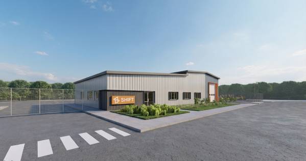
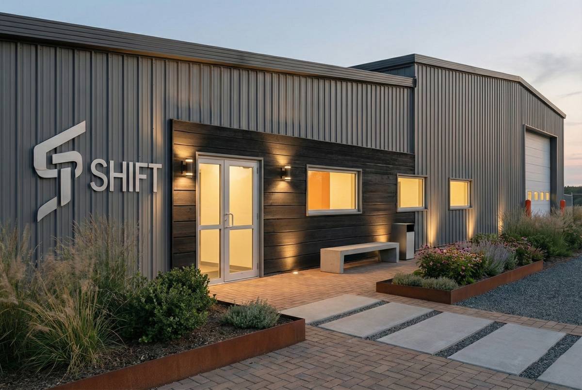
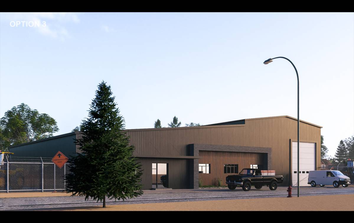
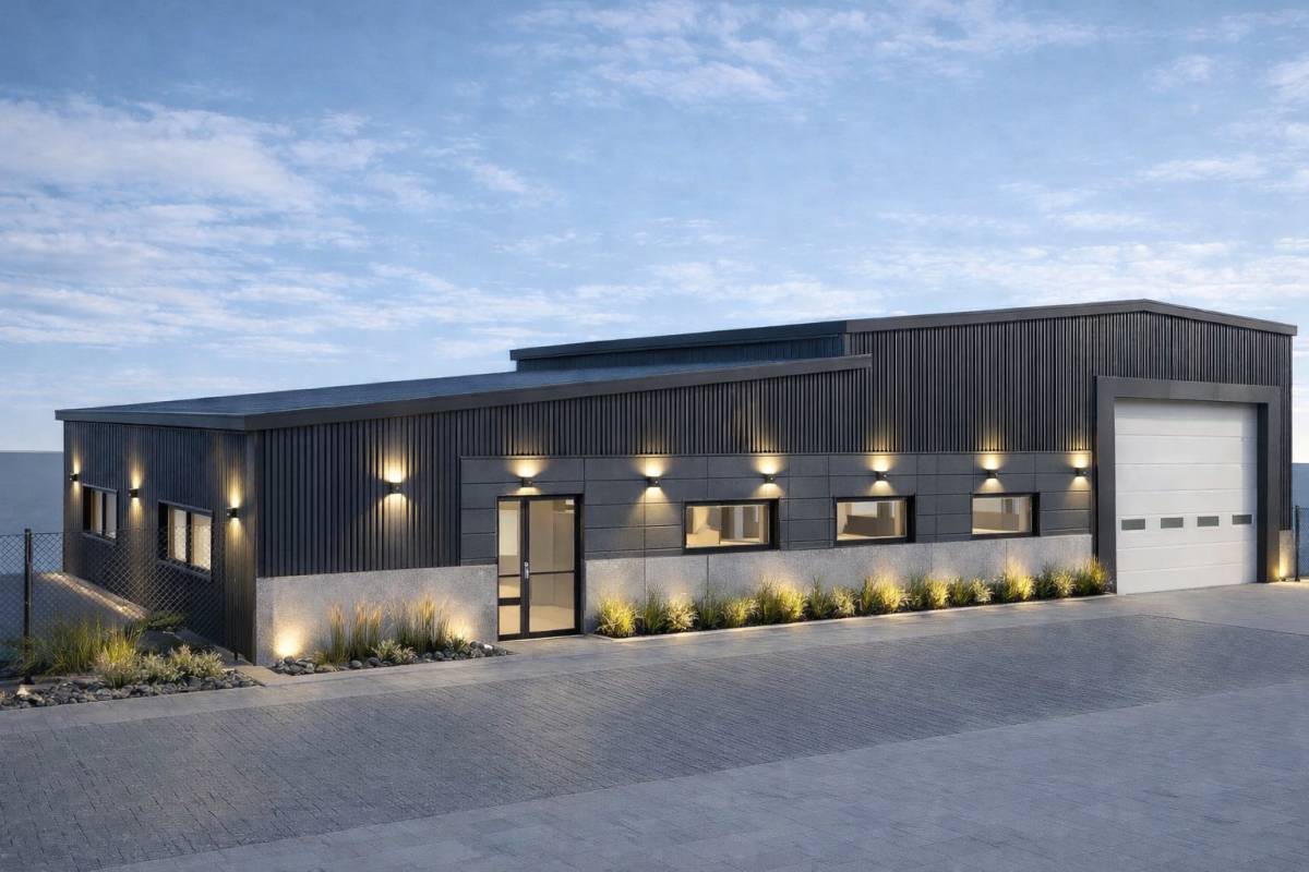
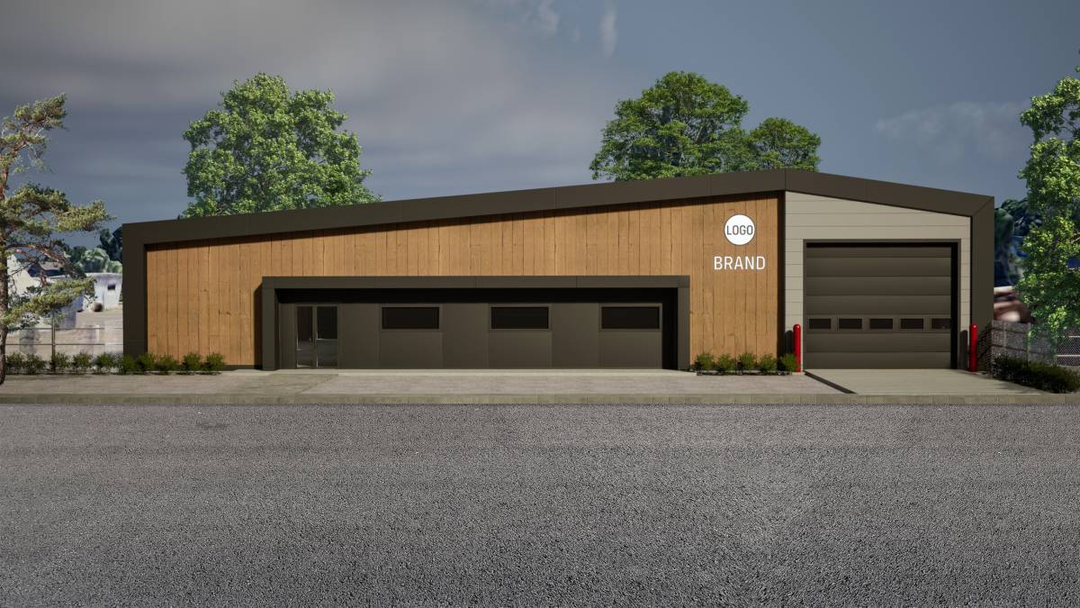
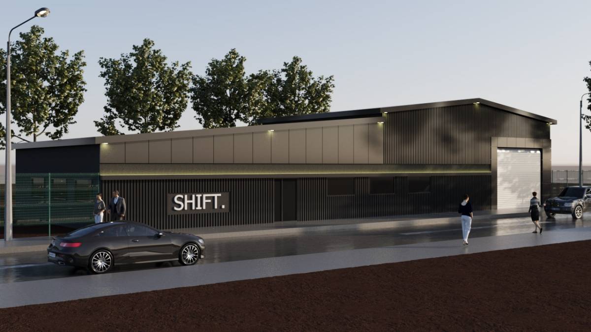
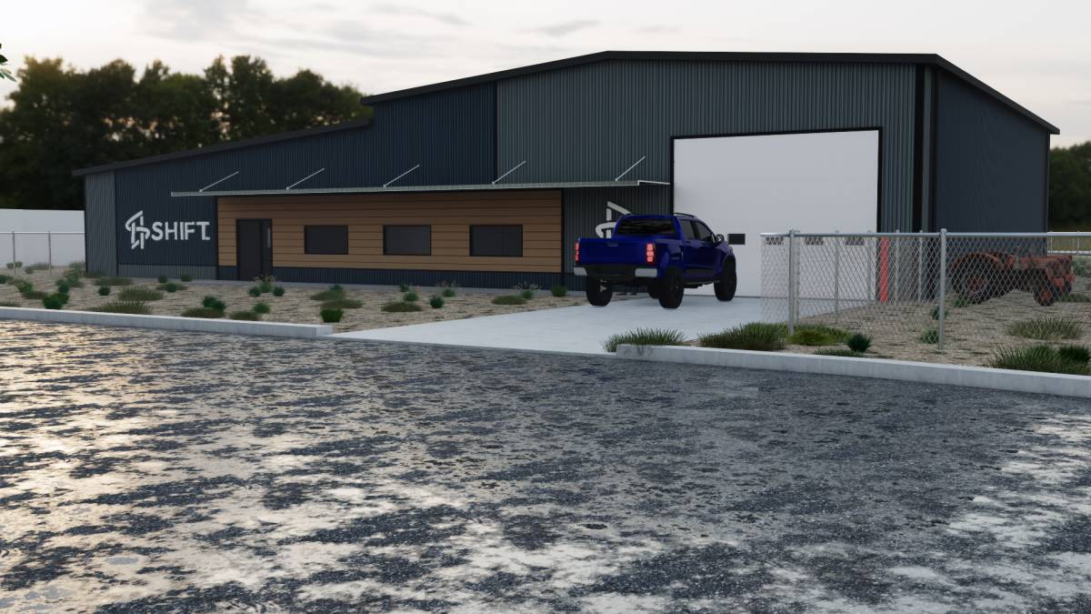
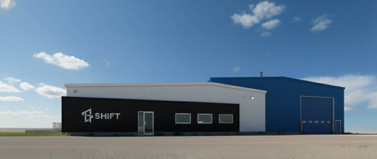
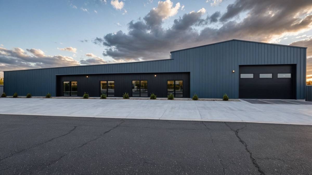
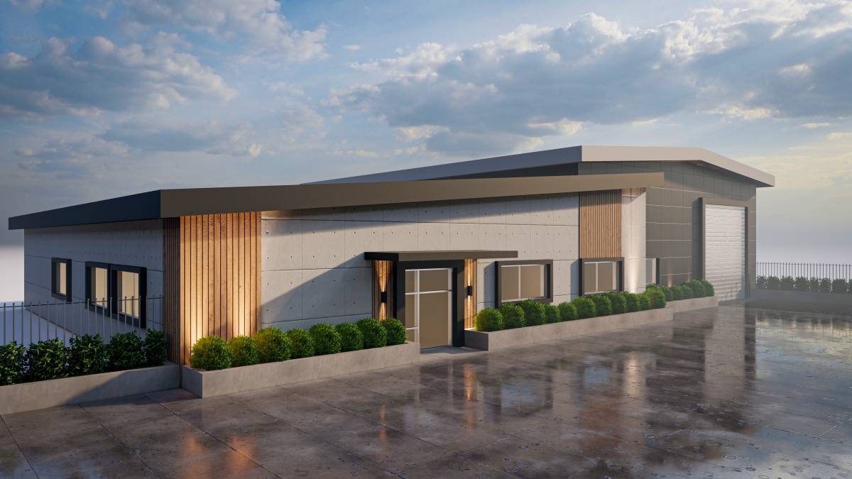
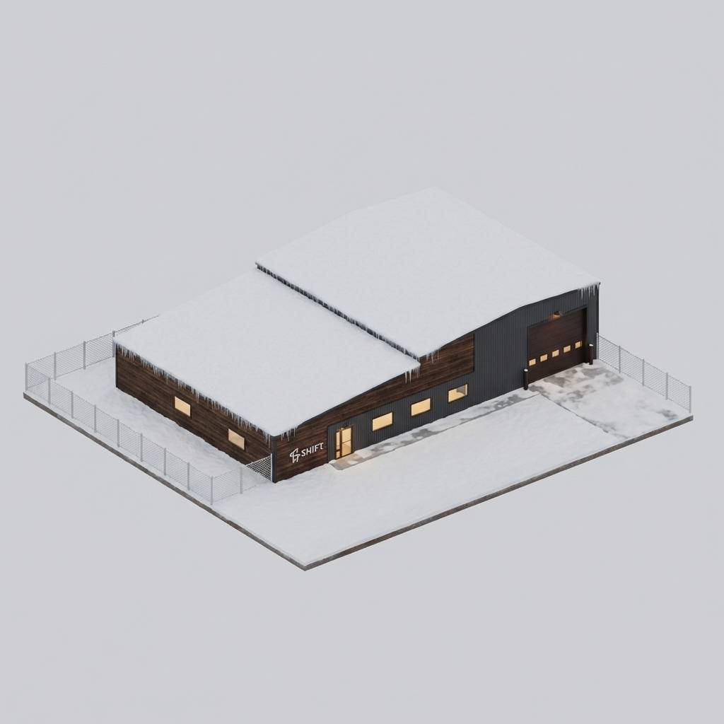
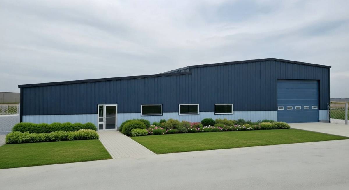
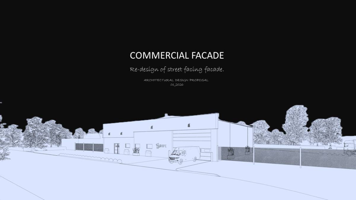
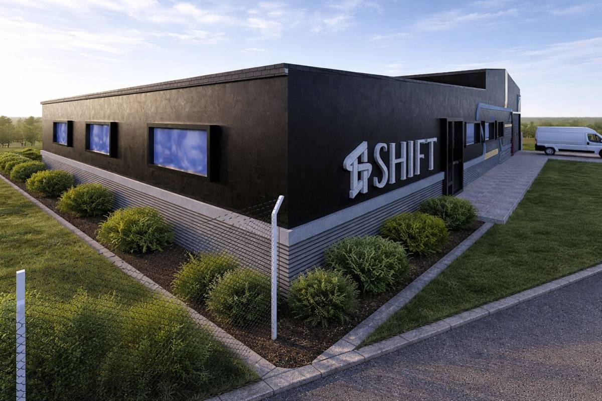
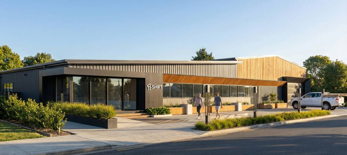
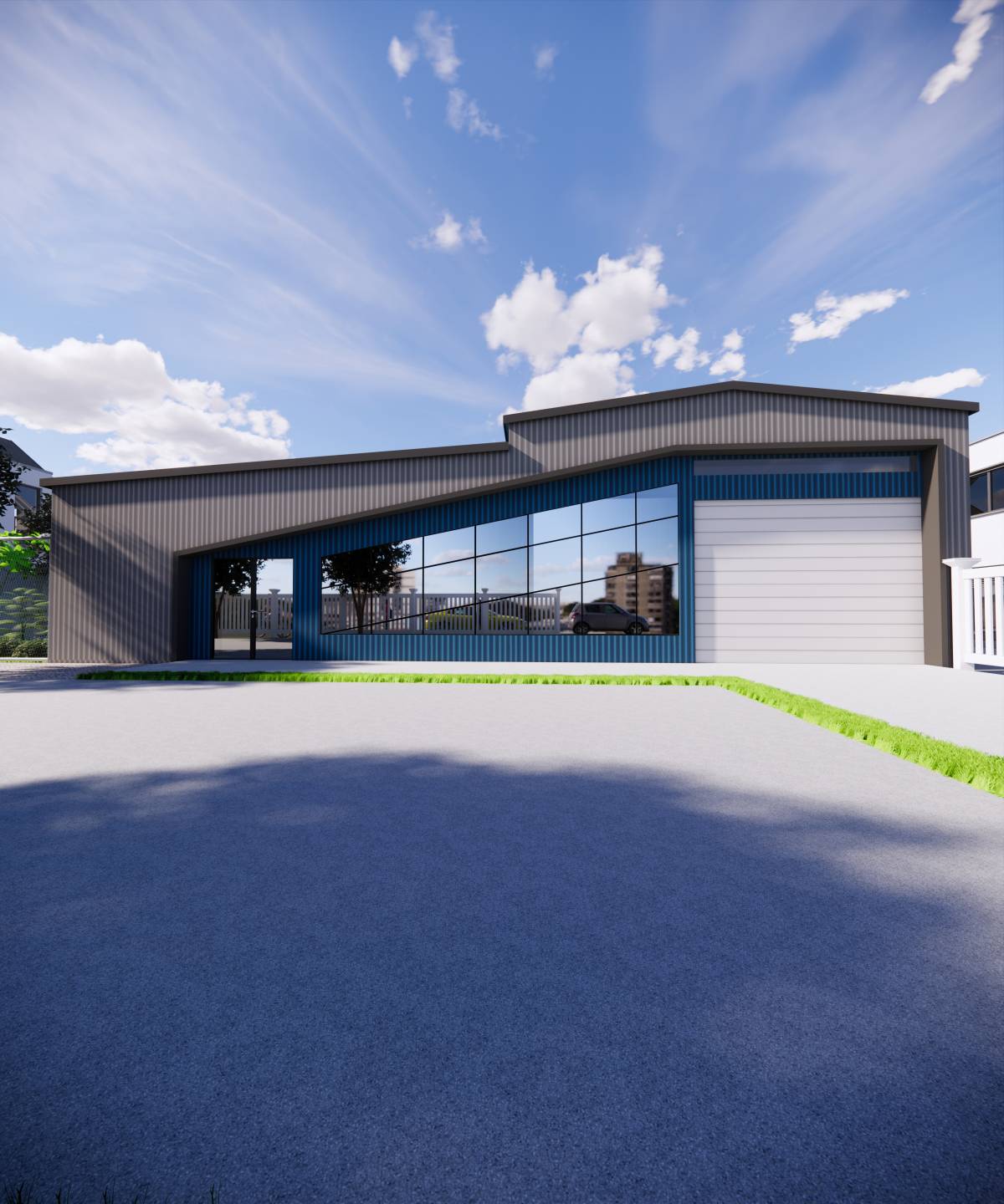
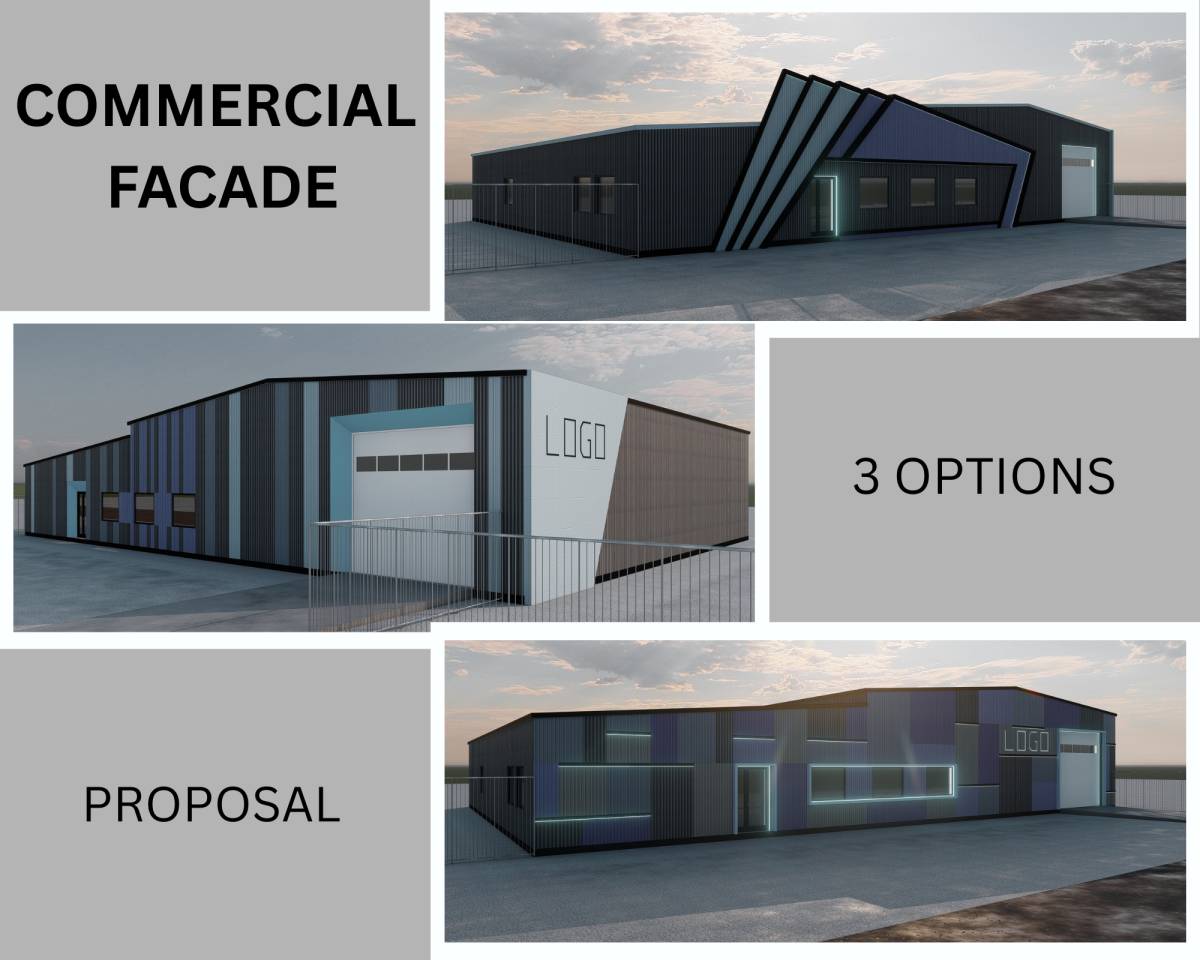
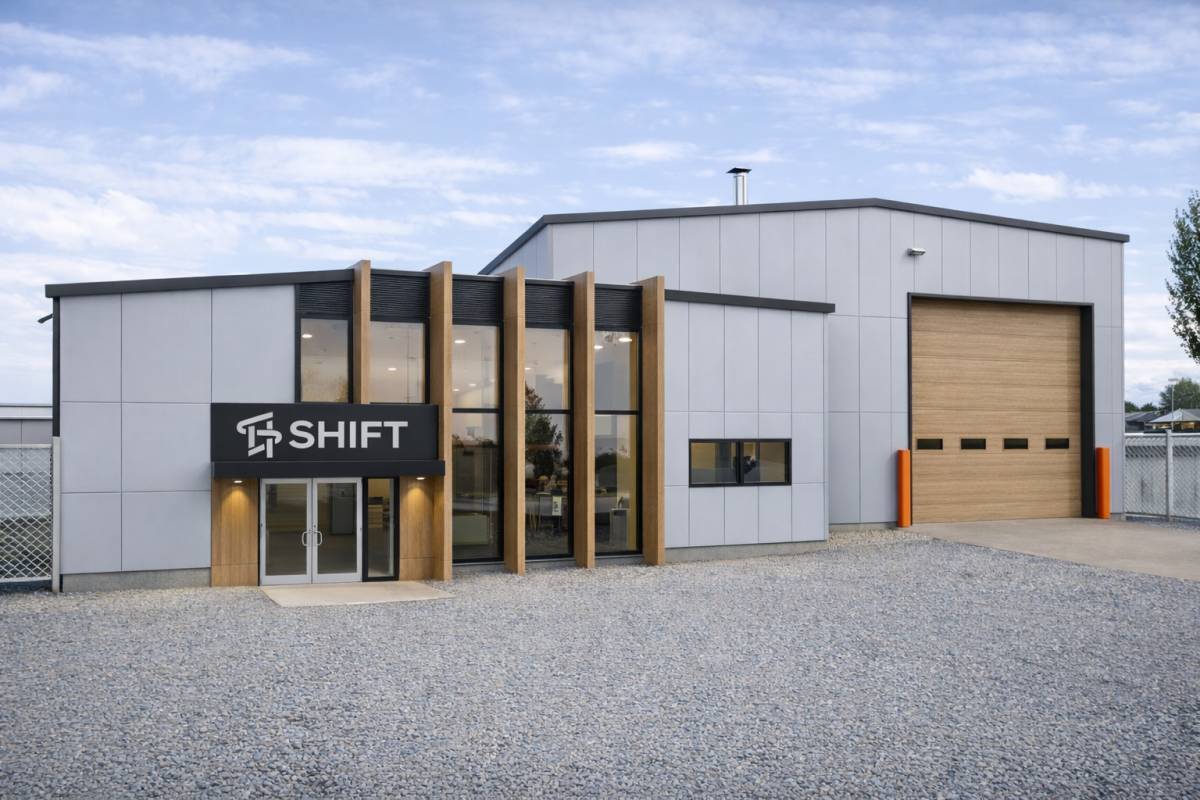
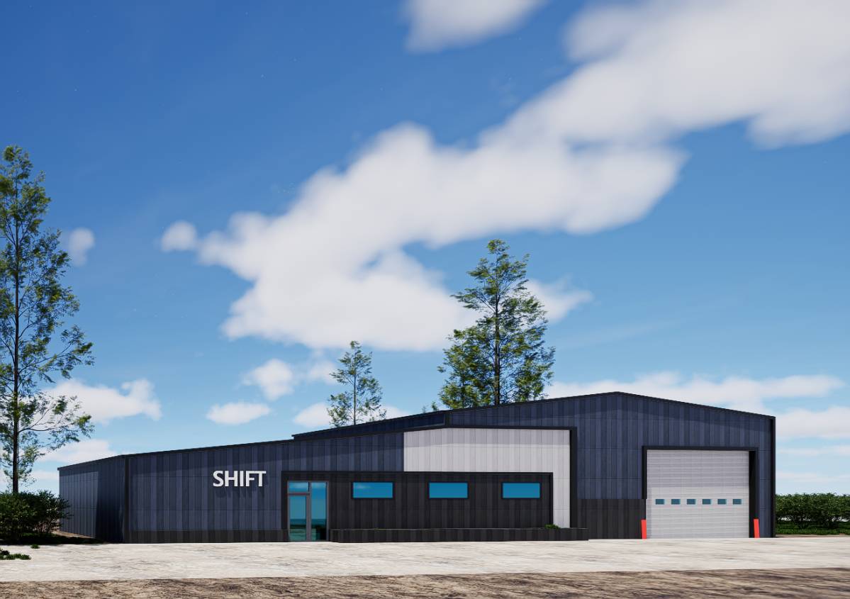
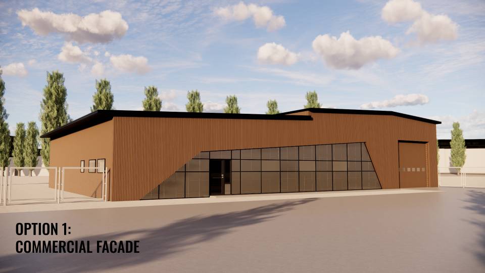
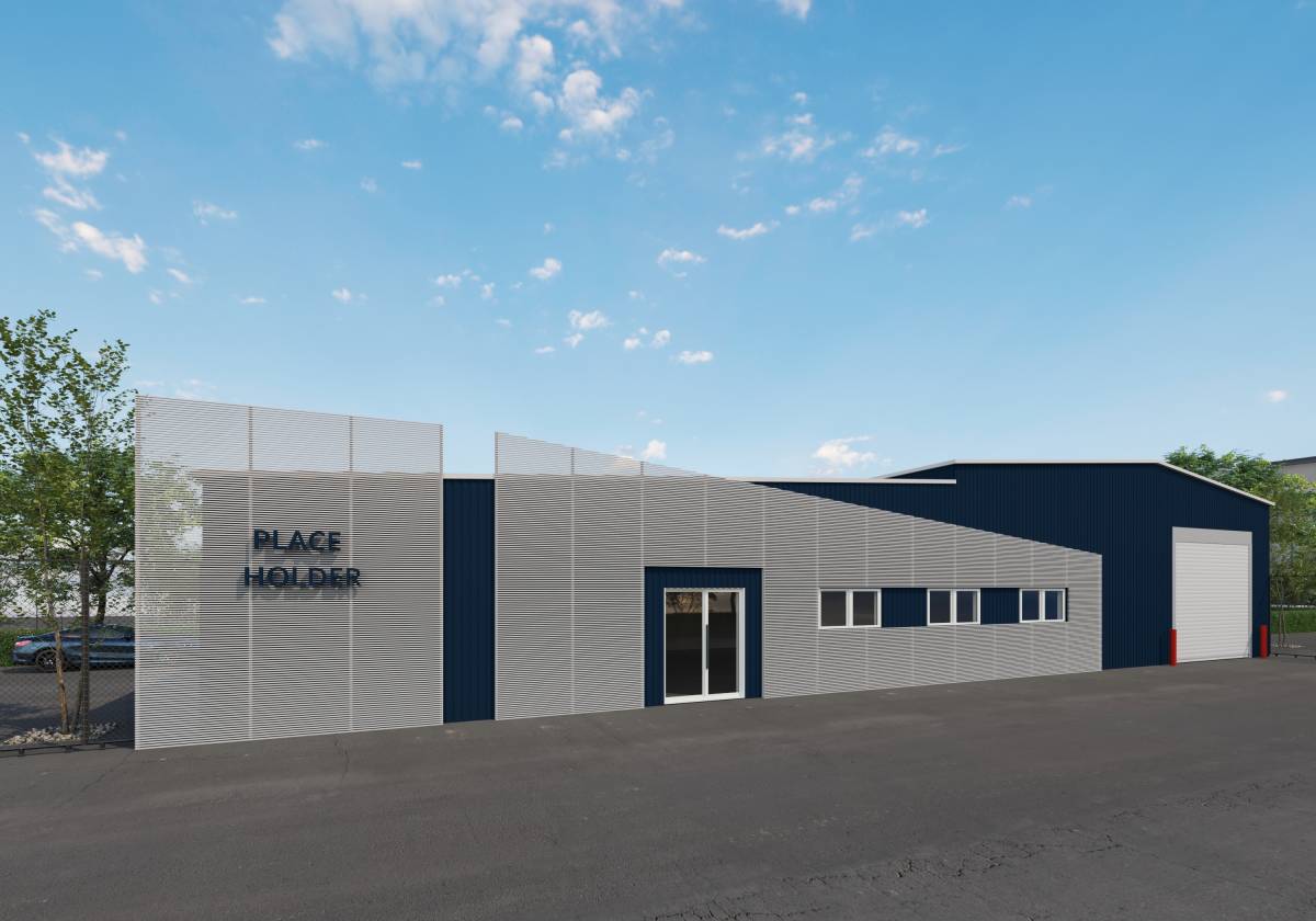
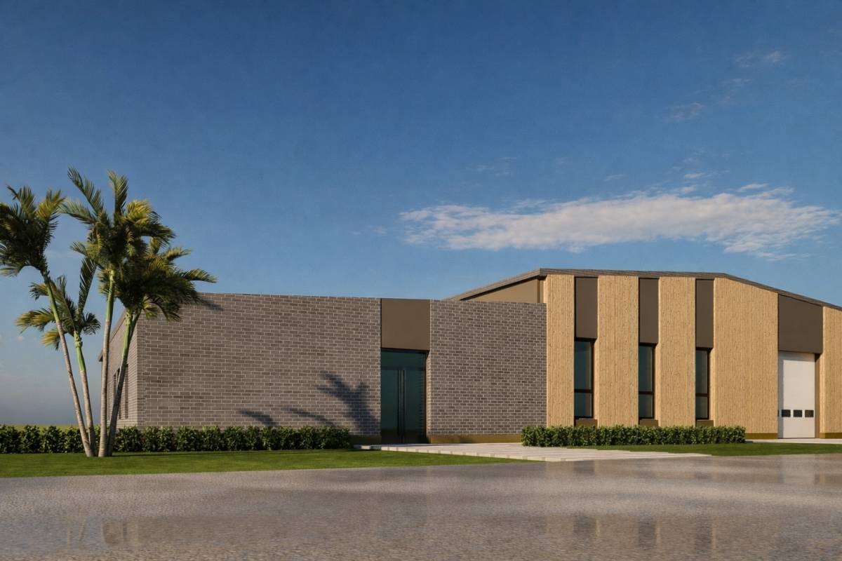
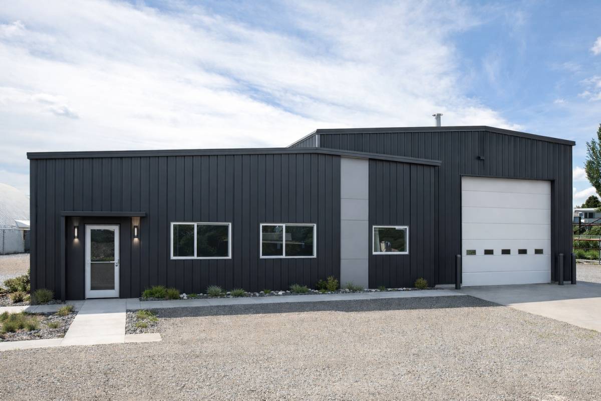
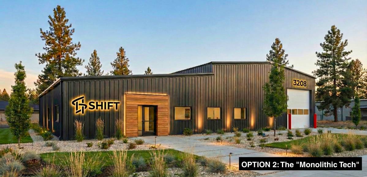
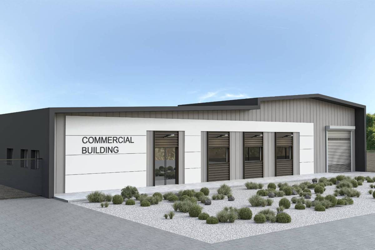
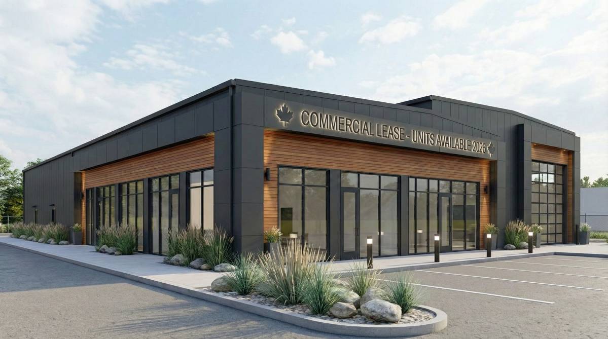
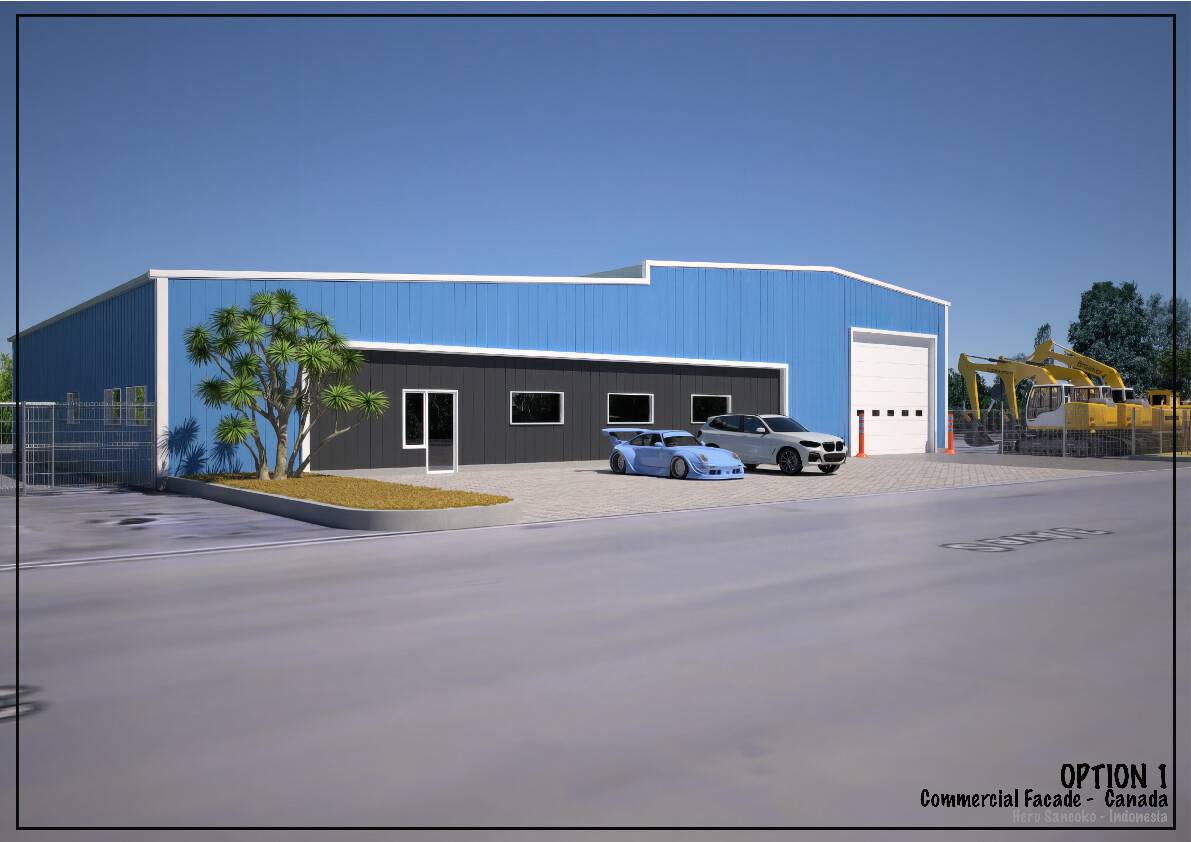
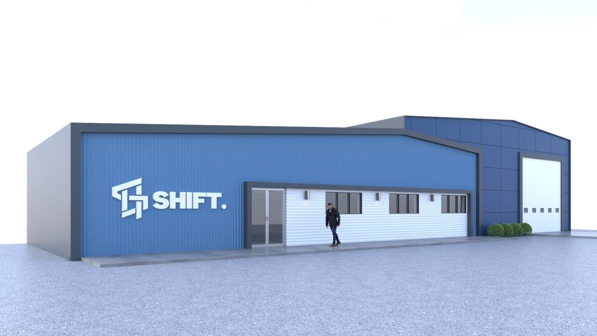
The primary objective of the facade design is to significantly improve curb appeal and modernize the building’s appearance while maintaining a clear, contemporary industrial identity. The approach focuses on transforming a simple volume into a visually engaging and corporate-facing structure through material articulation, color strategy, and controlled architectural emphasis—without altering roof lines or introducing unnecessary architectural elements.
A conscious effort was made to avoid any visual language that could associate the building with agricultural or farm-type structures. Instead, the facade is designed to communicate durability, professionalism, and modern industrial character.
Material Strategy
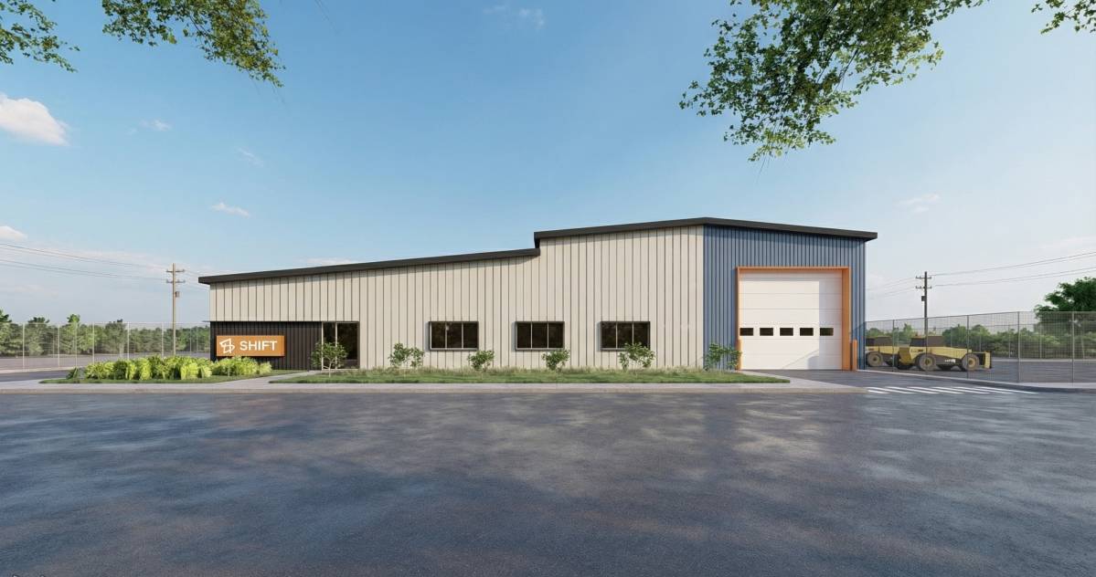
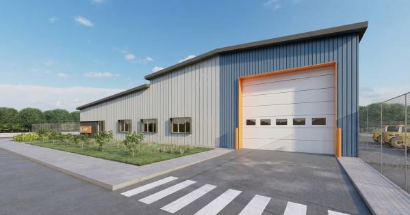
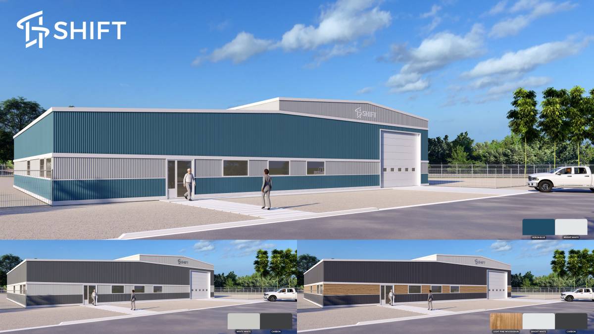
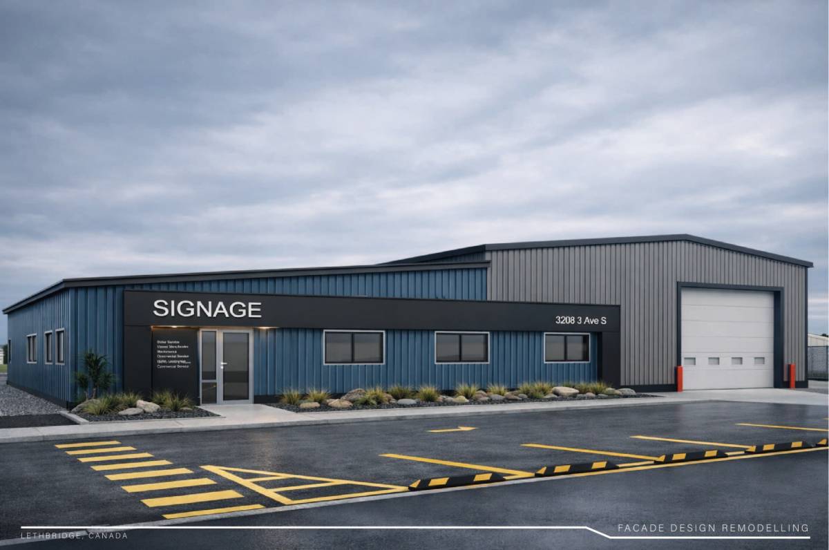
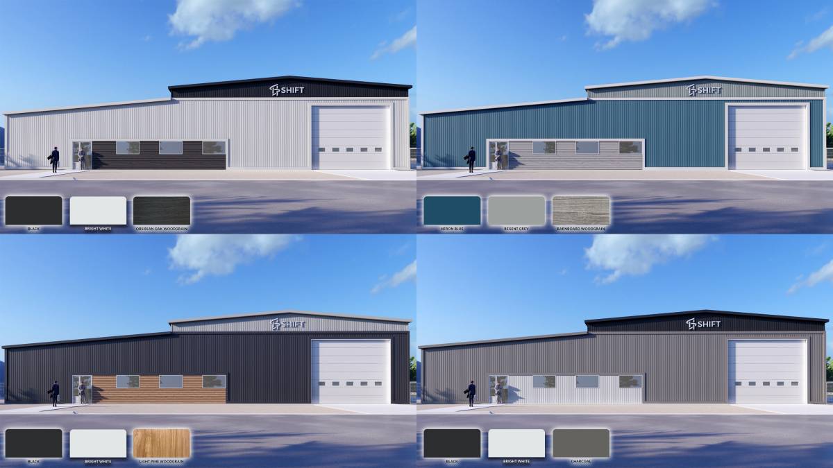
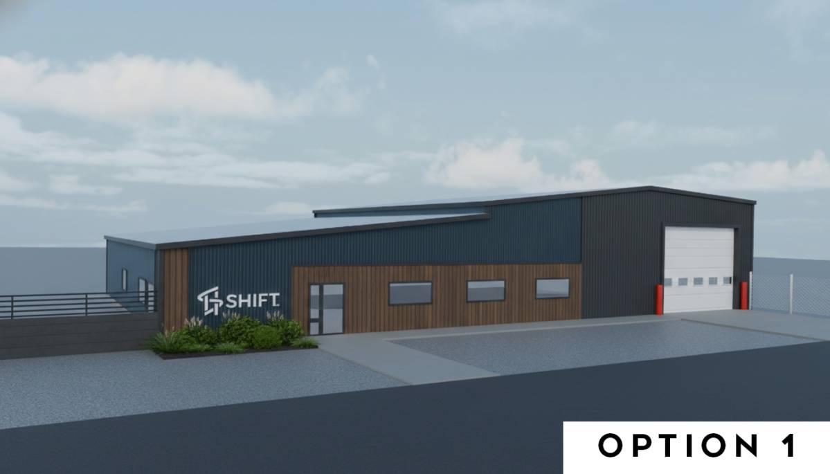
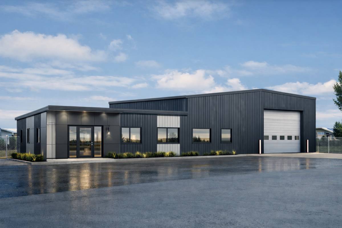
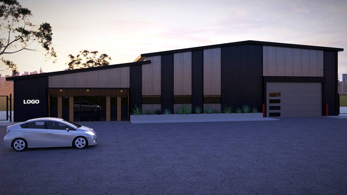
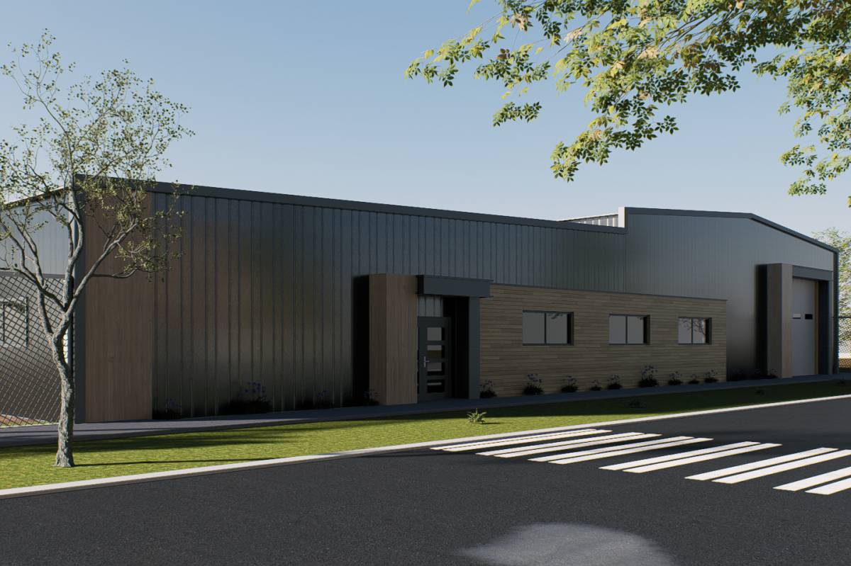
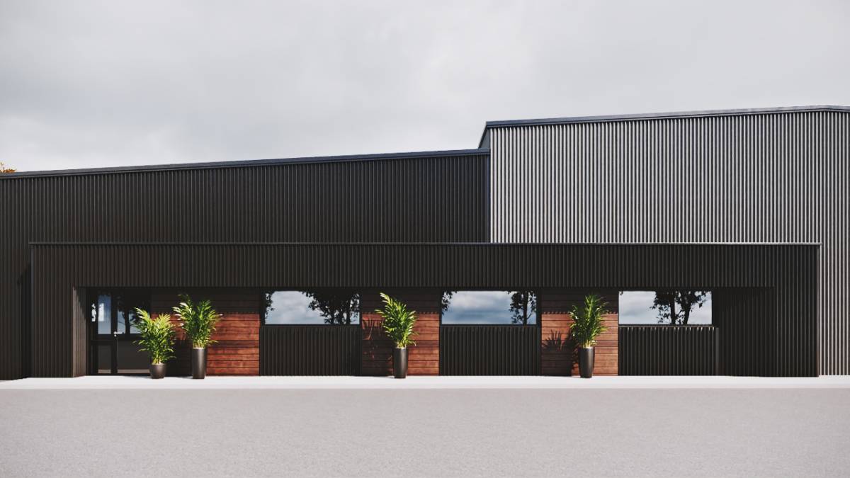
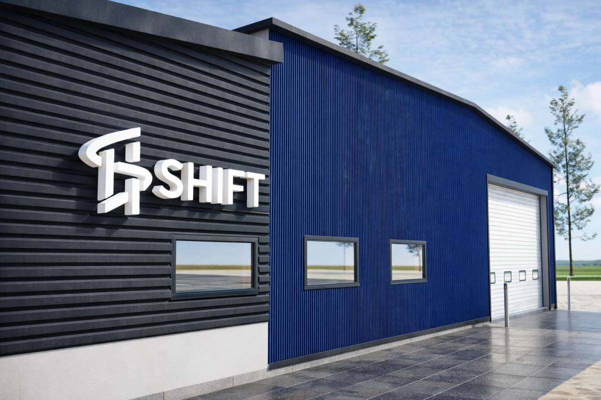
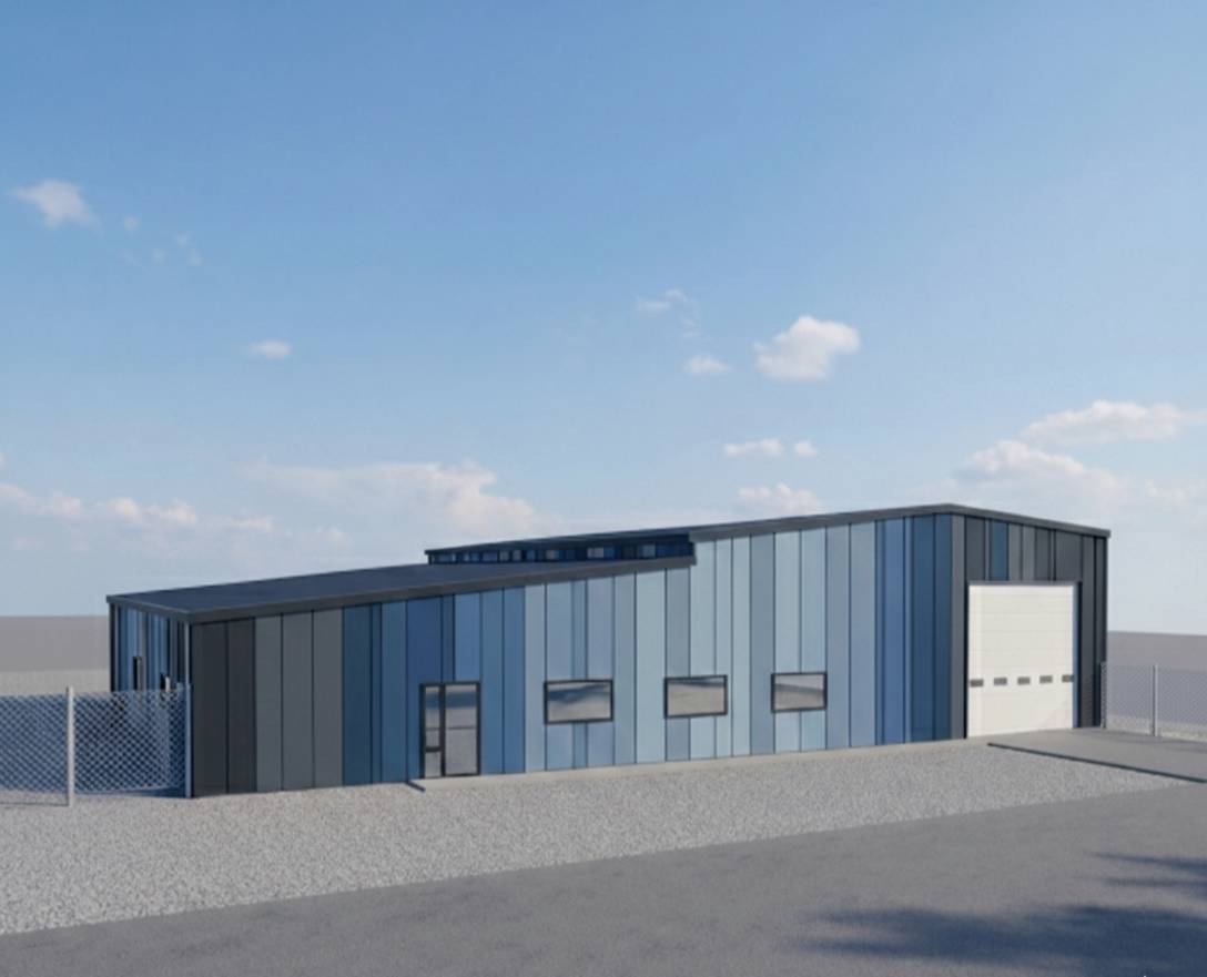
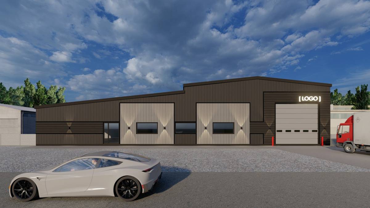
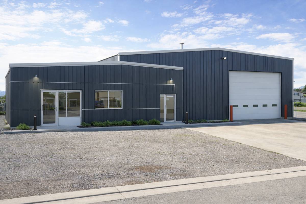
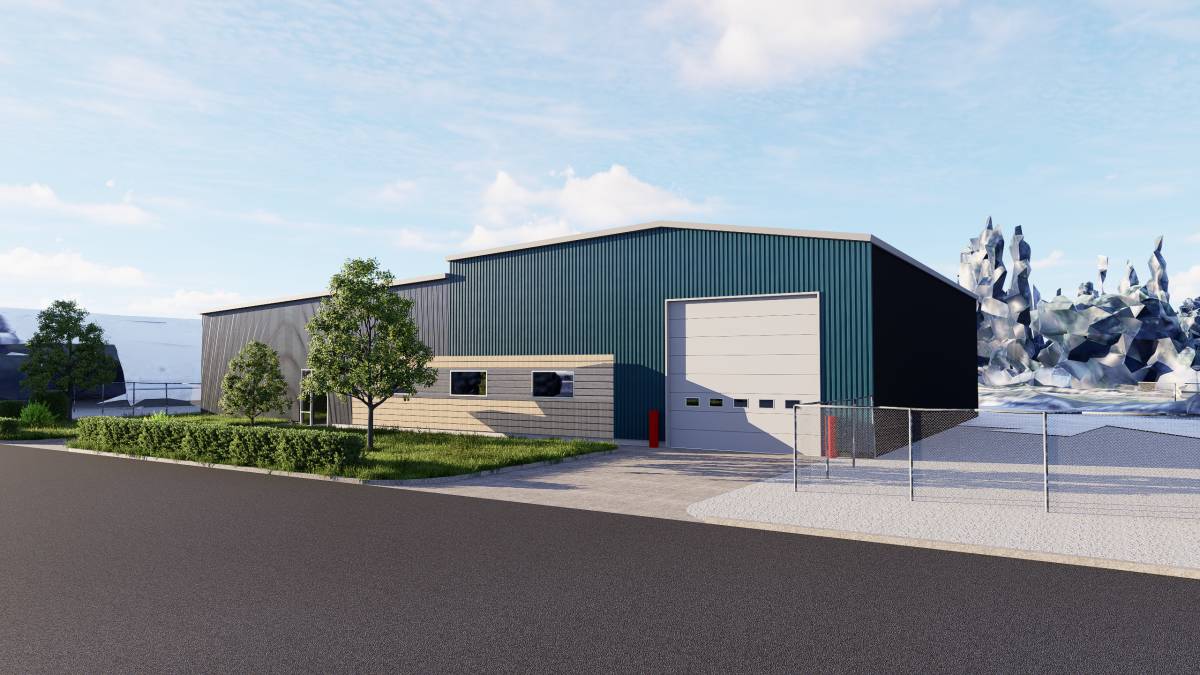
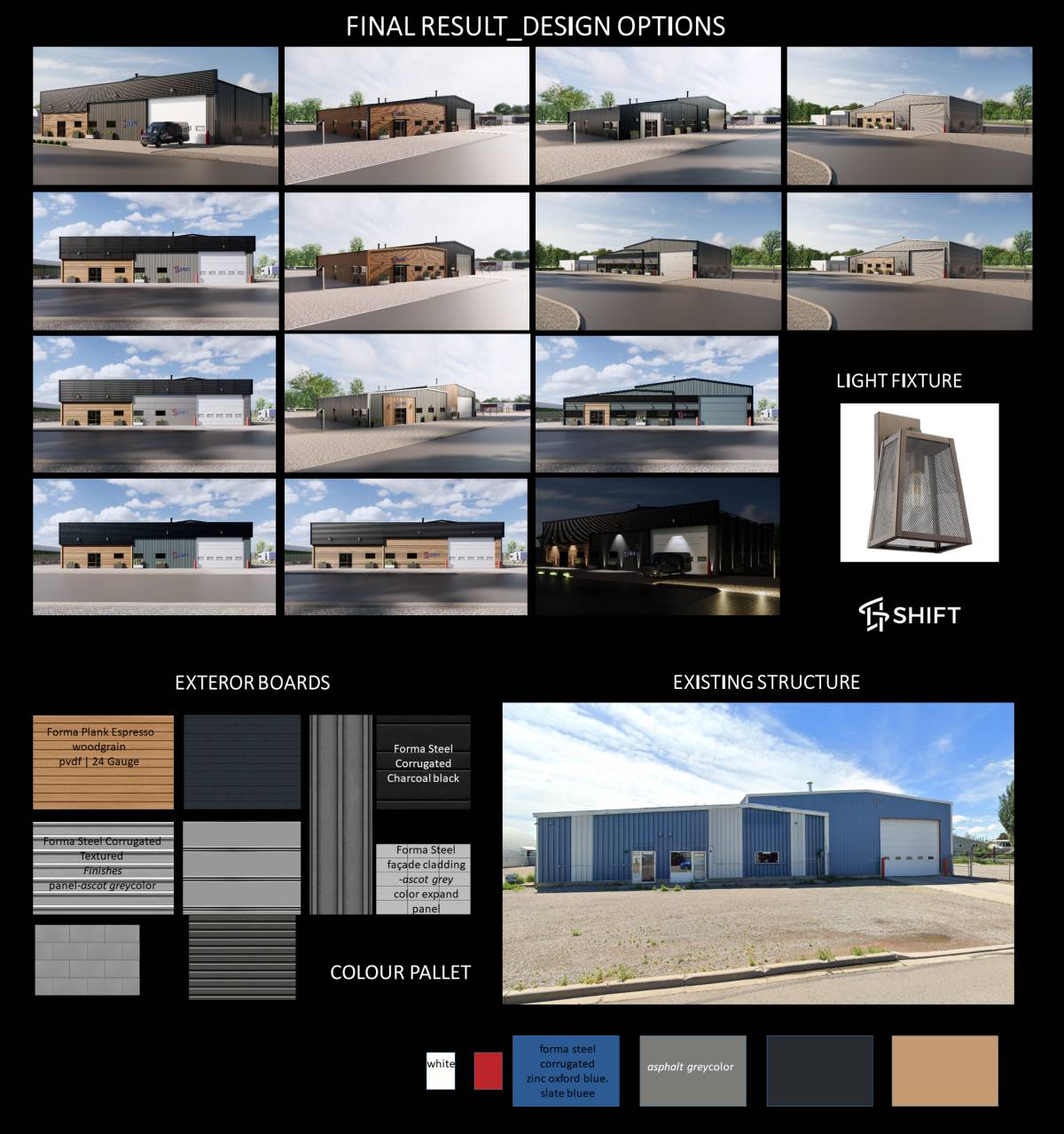
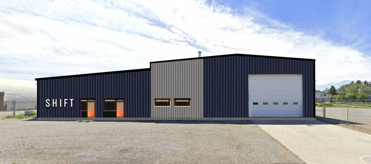
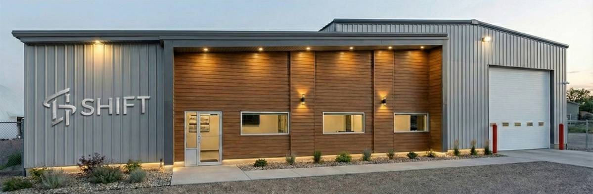
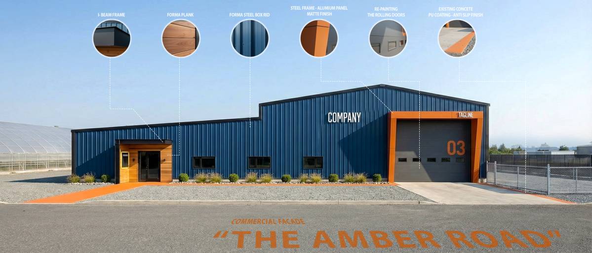
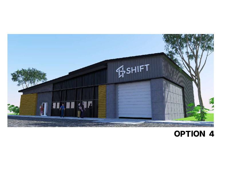
The facade is predominantly composed of Forma Steel cladding systems, utilizing Corrugated and Box Rib profiles as the primary exterior materials. These profiles provide texture, scale, and rhythm while remaining cost-effective and robust. Forma Plank is selectively incorporated to introduce a secondary layer of depth and dimensional contrast, helping to break down the overall mass of the facade and enrich its architectural reading.
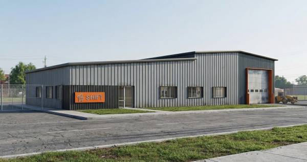
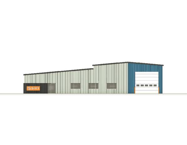
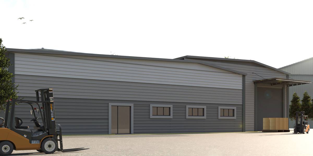
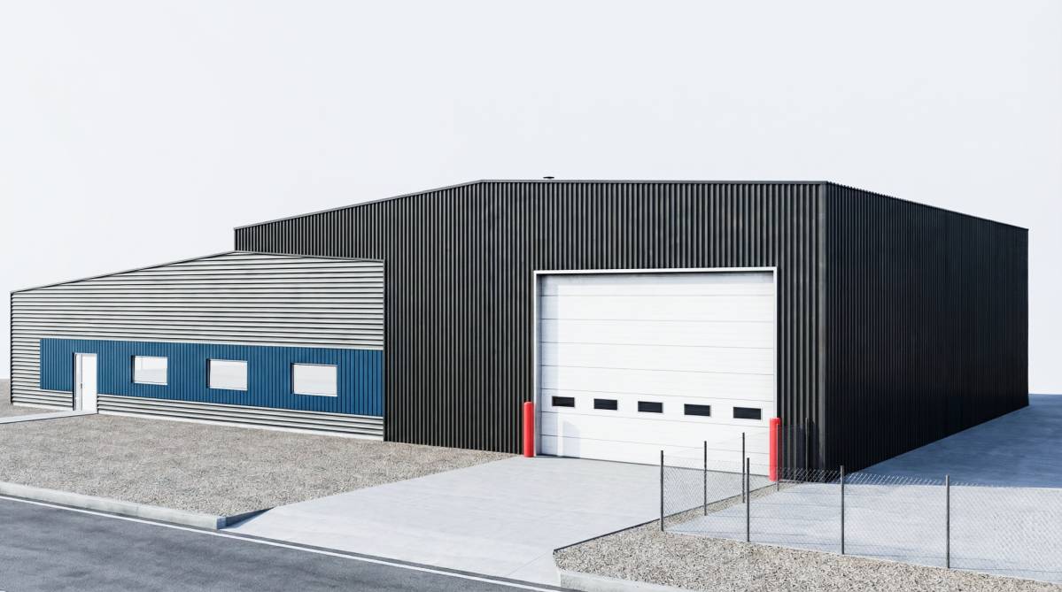
Remaining elevations are treated with a simplified cladding system, color-matched to the primary facade tone. This strategy ensures visual consistency across the building while carefully managing construction costs.
Color Concept
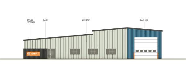
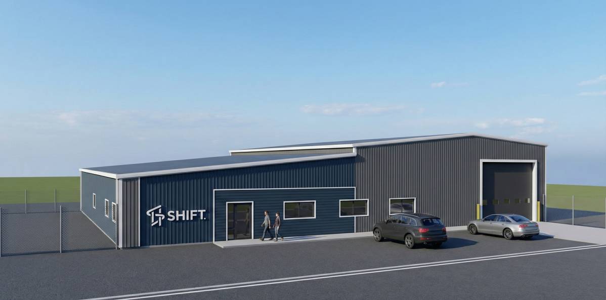
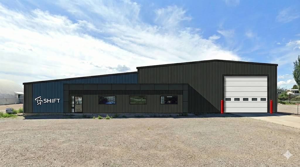
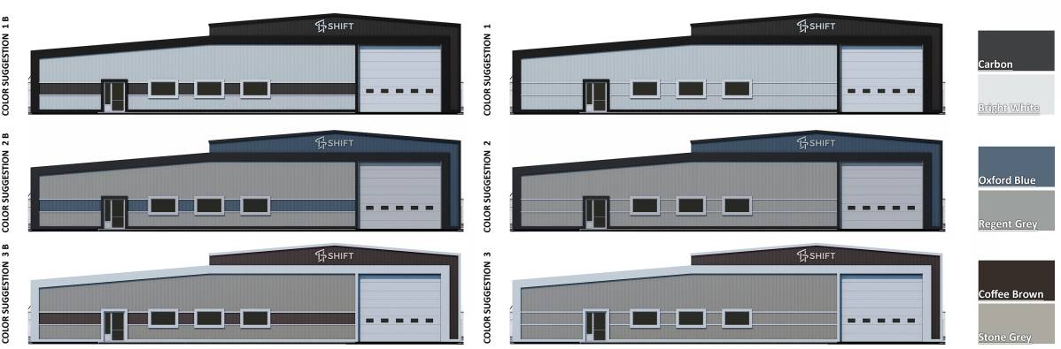
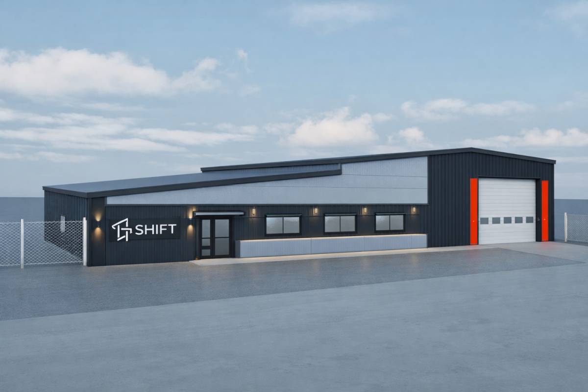
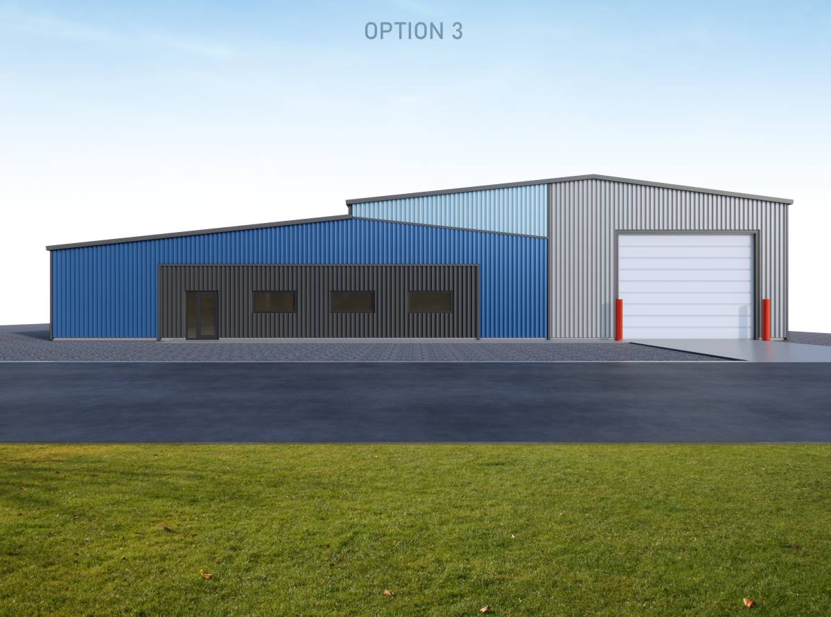
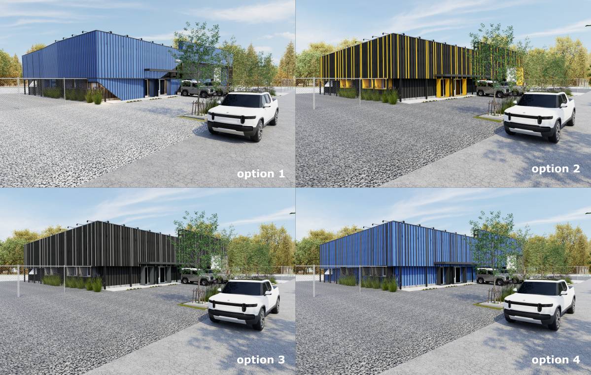
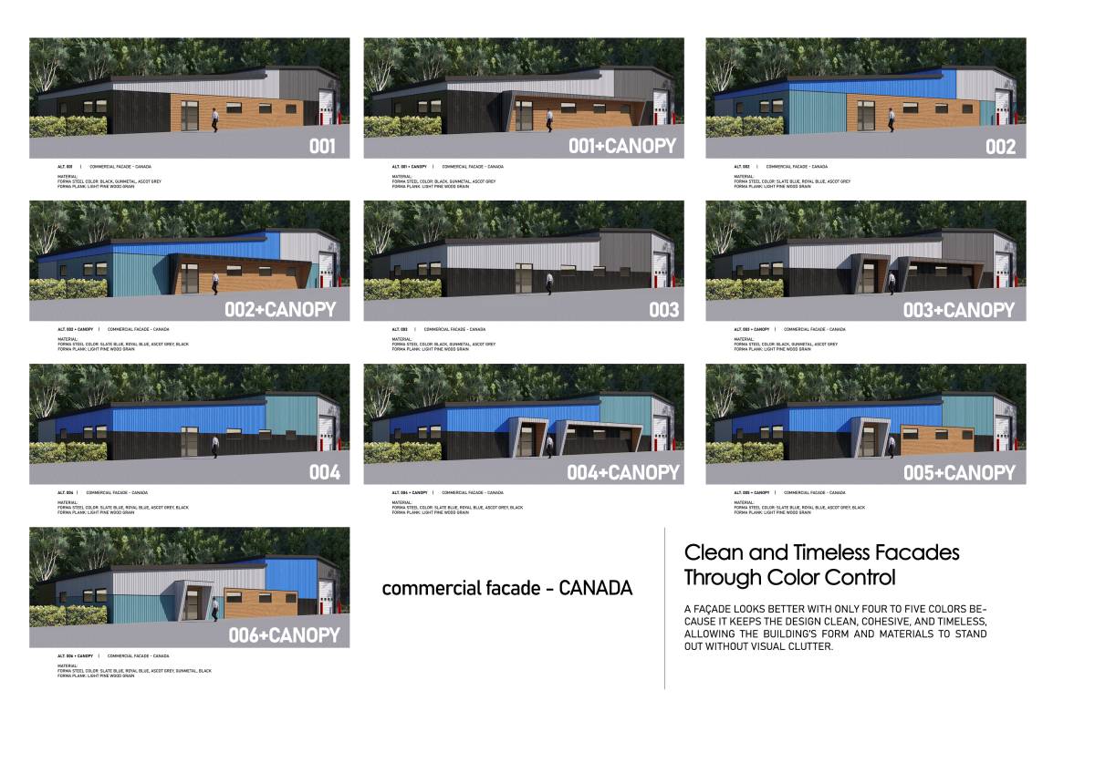
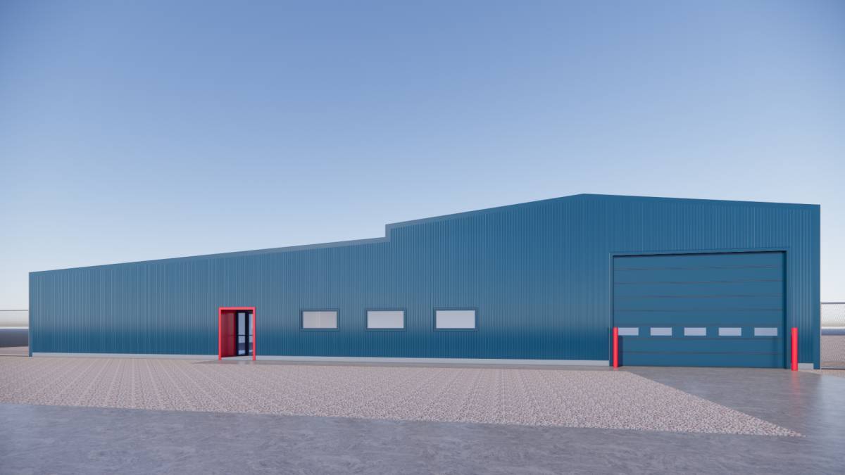
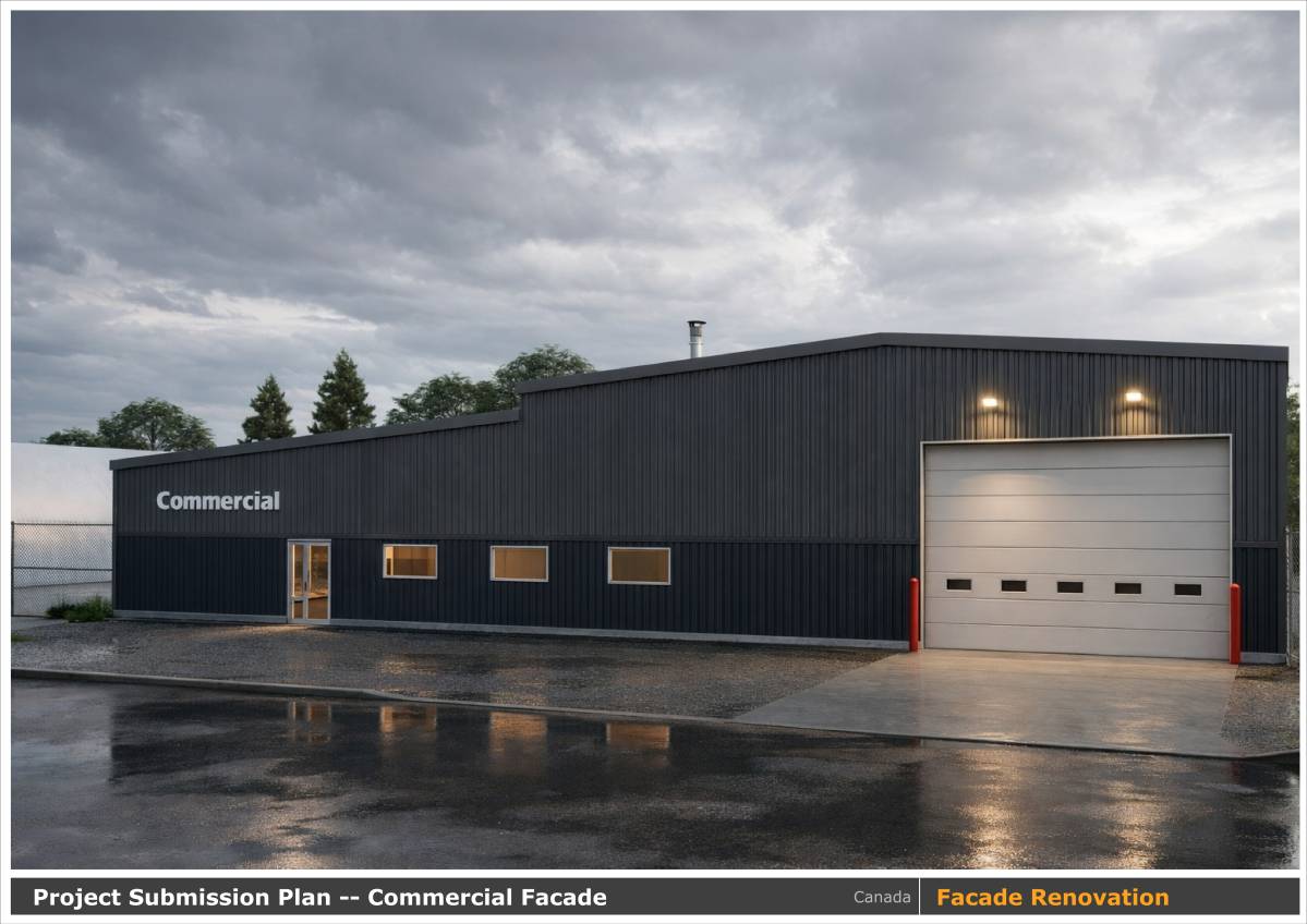
The core color palette is built around Slate Blue, Zinc Grey, and Black, creating a restrained, modern, and industrial base. These tones establish a calm and professional backdrop suitable for an industrial facility while enhancing material texture and shadow play.
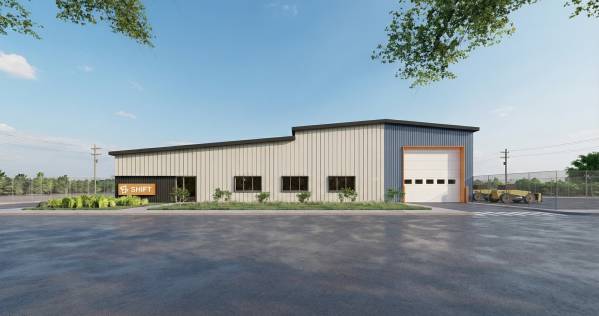
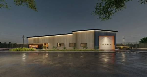
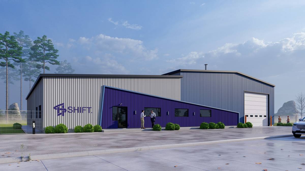
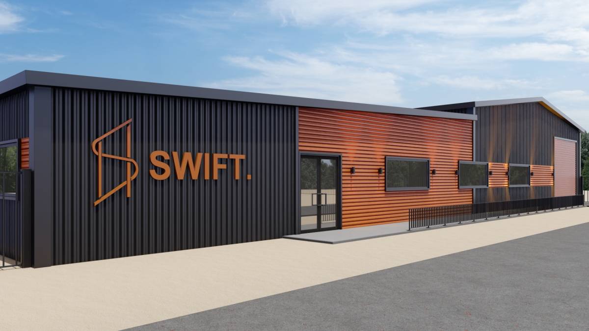
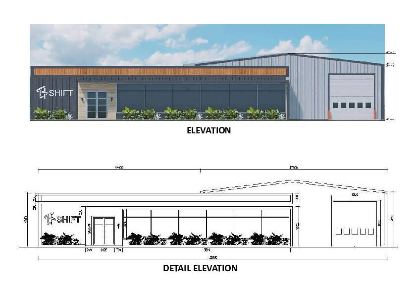
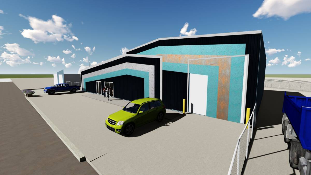
An optional Orange accent color is intentionally introduced as a strategic highlight rather than a dominant feature. The orange is first used behind the company name to strengthen brand visibility and create a strong focal point on the facade. To reinforce this gesture, the same color is extended around the sectional overhead door, forming a continuous visual sweep. This move connects branding and function, guiding the eye across the facade and animating the elevation without overwhelming it.
This controlled use of accent color enlivens the facade, adds visual energy, and establishes hierarchy, while keeping the overall composition disciplined and professional.
Openings and Details
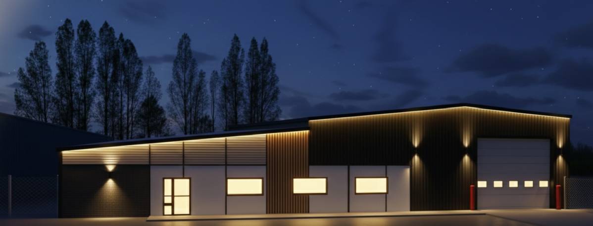
New window openings shown in the mock-ups are incorporated into the design and carefully integrated into the facade composition. All windows and the main entry door are specified as clear-anodized aluminum, reinforcing a clean, contemporary aesthetic and complementing the metal cladding without competing with the primary color scheme.
The sectional overhead door remains unpainted, in line with the client’s preference. Instead of altering the door itself, its presence is emphasized through surrounding color and framing, allowing it to read as an intentional and integrated element of the facade design.
Canopy and Architectural Restraint
No canopy is introduced as part of the design. This decision supports a clean and uncluttered architectural expression while avoiding potential long-term issues related to drainage and freeze–thaw cycles. The absence of a canopy reinforces the facade’s clarity and industrial honesty.
Conclusion
The proposed facade design delivers a modernized, visually engaging exterior that enhances curb appeal and corporate identity through thoughtful material selection, a refined color palette, and strategic accentuation. By working within defined constraints—maintaining roof lines, controlling costs, and respecting functional requirements—the design achieves a strong architectural presence that is contemporary, durable, and distinctly non-agricultural.